
Component Library
Termina provides a set of built-in layout nodes (components) for building terminal UIs. Each component handles a specific rendering concern and can be composed together.
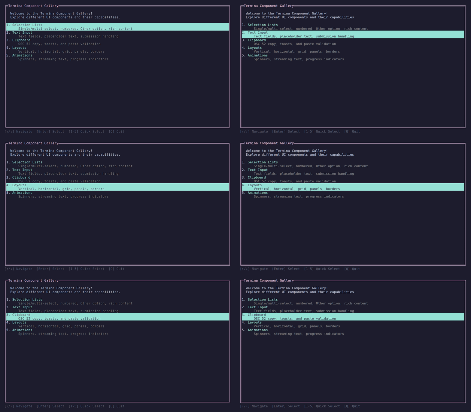
The component gallery — demos/Termina.Demo.Gallery.
Display Components
| Component | Description |
|---|---|
| TextNode | Renders styled text with word wrapping |
| PanelNode | Bordered container with title |
| SpinnerNode | Animated loading indicator |
| GraphNode | Live scrolling graph with gradient coloring |
| ProgressBarNode | Progress bar with gradient fill and label |
| StreamingTextNode | Streaming text with scrolling |
Input Components
| Component | Description |
|---|---|
| TextInputNode | Single-line text input with cursor |
| TextAreaNode | Multi-line text input with word wrap and vertical scrolling |
| CopyableTextNode | Read-only text with keyboard selection and clipboard support |
| SelectionListNode | Interactive list selection with keyboard navigation |
| FilePickerNode | File/folder picker with directory navigation and filtering |
Container Components
| Component | Description |
|---|---|
| ScrollableContainer | Vertical scrolling container |
| StackLayout | Overlapping children (z-stack) |
| ModalNode | Modal overlay with backdrop |
Reactive Components
| Component | Description |
|---|---|
| ReactiveLayoutNode | Updates content from observables |
| ConditionalNode | Show/hide based on condition |
DynamicLayoutNode | Re-evaluates factory on invalidation |
KeyedDynamicLayoutNode | Key-based content with retained or transition-evicted children |
Composite Components
| Component | Description |
|---|---|
WizardNode | Multi-step wizard with progress, navigation, and focus |
Utility Components
| Component | Description |
|---|---|
| EmptyNode | Placeholder that renders nothing |
| DeferredNode | Delegates to node without owning it |
Common Patterns
All components inherit from LayoutNode and share common methods:
csharp
// Size constraints
node.Height(3);                      // Fixed height
node.Width(40);                      // Fixed width
node.Fill();                         // Fill remaining height
node.WidthFill();                    // Fill remaining width
node.HeightAuto();                   // Auto-size to content
node.Width(SizeConstraint.Percent(50)); // Percentage

// Get constraint object for custom use
node.HeightConstraint = SizeConstraint.Fill(weight: 2);Creating Custom Components
See the Custom Components guide for building your own layout nodes.